Creating an UI library for ReScript

Hey everyone :wave:
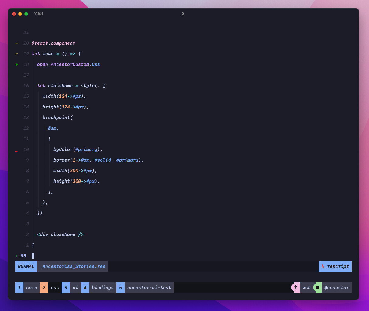
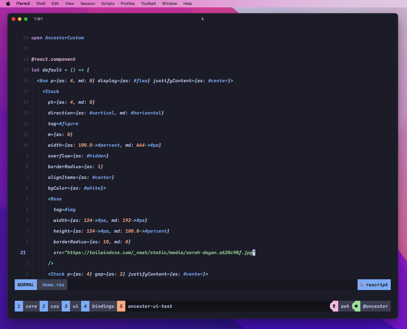
One year ago, I created an UI library for ReScript called Ancestor, which does not focus on providing styled components but provides layout primitives, styled responsive props and base components to create your design system, styleguide and/or your app.

I’m using this library in some production projects, like Portocred. I received some very positive feedback about the library, its API, documentation and DX. Now, I’m planning to make this project bigger and turn this library into something very similar to Chakra UI, but for ReScript.

I know that many of you are using existing UI libraries from the JavaScript ecosystem, like Tailwind (which is very easy to use since that doesn’t need bindings) or Chakra UI, Material UI, etc.However, I think that these libraries are designed for TypeScript rather than ReScript and things like customization or developer experience might not be so good as is when using with TypeScript.

I aim to provide a first-class experience for creating user interfaces for the ReScript community by providing a complete, accessible, type-safe and customizable UI library that relies on the ReScript’s type system (and many other features like module functors) to create better softwares.

So, I’m working with a professional designer who is creating the whole design system specification for components like button, inputs, dropdown, menus, etc. We’ll provide a Figma library to allows you (or your design team) to customize and use the library not just for the coding step, but also for designing your interfaces.

So, having said that, I want to get your honest feedback. I talked to @fakenickels, @diogomafra and @zth about that project and they really liked it, but, I really appreciate the community feedback because I’m creating this not just to me, but is also to you and it would be great to hear your thoughts about this project :grinning_face_with_smiling_eyes:

19 Likes

That sounds fantastic…!

Something that I’d wish for, would be good integration with Tailwind (so that we can tweak the design via TW classes).

However, I’ve never used Chakra UI or Material UI, so maybe that wouldn’t make sense.

1 Like

I’m glad you liked it :slight_smile:

Something that I’d wish for, would be good integration with Tailwind (so that we can tweak the design via TW classes).

Probably we’re going to use a different approach, but you’ll be able to customize everything like you do with Tailwind.

Hi!
I didn’t know about Ancestor, but now I’m really excited!! :partying_face:
I always wanted to have a “built with & for ReScript” UI lib but since lacked the time and focus to pull it off myself…

We mostly use material ui bindings,...

We mostly use the material ui bindings, which @jsiebern started. It was the most convenient way for us to go, at the time being. (about 3 years ago) He did amazing work to provide bindings for such a vast api surface. But there are still inherent “js api querks” (my “favorite” being props getting respected only if another prop has the correct value) and the fact, that it will always be “material” which we chose for dev convenience - not for beauty. :wink:

I’m definitely looking forward to your next achievements and will look into Ancestor more thoroughly soon. Congratulations for your past work until today. The lib seems great and is a very attractive option to me.

Hey @woeps, thanks for asking this post, it means a lot to me :grinning_face_with_smiling_eyes:

I always wanted to have a “built with & for ReScript” UI lib but since lacked the time and focus to pull it off myself…

The same here. There are great options for JS/TS like MUI or Chakra, but they’re built for JS/TS and even when using bindings, it lacks a good API or a first-class developer experience.

Ancestor is getting bigger, I’m working on multiple packages that will be used to build the new version of the core (currently the version available through the package @rescriptbr/ancestor.) and UI library.

I’m definitely looking forward to your next achievements and will look into Ancestor more thoroughly soon. Congratulations for your past work until today. The lib seems great and is a very attractive option to me.

You can follow my progress here. Currently, I’m working on a package that will provide a first-class experience to write CSS, supporting design tokens that will be used on the customization API of the UI package. Here is a preview of the current API:

@react.component
let make = () => {
  let css = AncestorCss.useCss()
  let className = css.createClass({
      display: #flex,
      bgColor: #primary,
      color: #secondary,
      fontSize: #rem(2.4),
      fontWeight: #700,
      width: #px(200),
      p: #sm,
      mt: #md,
      mb: #sm,
      borderRadius: 2.0,
    })

    <div className />
}

You can see more about this package here.

2 Likes

I poked a little around in your code and left you some questions on GitHub (Why use ppx-ts? & Building on top of bs-css vs rolling your own emotion wrapper) to continue more specific discussion there.

I am just curious about your thoughts and ideas. - Please don’t take my questions as criticism.

P.S: If I understand your approach correctly: If the goal was to just use design-tokens in class definitions, this could be done without any functor and just a custom module holding the tokens. But since you are providing components which e.g. “know” how to scale there spacing and handle custom types, they need to be the result of a functor. Correct?

I poked a little around in your code and left you some questions on GitHub (Why use ppx-ts? & Building on top of bs-css vs rolling your own emotion wrapper ) to continue more specific discussion there.

Oh, nice! I answered your questions :grinning_face_with_smiling_eyes:

P.S: If I understand your approach correctly: If the goal was to just use design-tokens in class definitions, this could be done without any functor and just a custom module holding the tokens. But since you are providing components which e.g. “know” how to scale there spacing and handle custom types, they need to be the result of a functor. Correct?

Yep, you can create a module “Theme” that holds all of your tokens, but the goal is to provide a custom module that already knows these tokens and leverages the type-system to check for these custom tokens.

1 Like

Creating UI controls that work well is extremely difficult. We need many controls - hierarchical menus, split buttons, panels, accordions, calendar pickers, numeric input, etc. There is a lot of subtlety to get the details right. For example, menus on the Mac work with click and drag OR click-click-click. Keyboard navigation and focus indicators are important. If you look at the Material UI web site and click on a demo of their pop up menu you’ll see there is no way to choose a menu item with the keyboard only. It is kind of sad that in 2022 the UI components built into the browser are so primitive; a select element can’t show anything but text and there are no menus or dialogs. Many of the UI libraries are tied to specific frameworks like React or Angular rather than being based on web components.

I chose Microsoft Fluent UI controls - Home - Fluent UI - because they are battle tested in sophisticated Microsoft apps, have a large team of people working on them, and are designed for React. They also offer a list box (data grid) that can handle multi-selection and variable height rows with custom content. I tried creating bindings for Fluent UI and it was a hassle. I may wrap some of the Fluent UI in a simpler TypeScript component and import it with gentype; that way I don’t have to do ReScript bindings for the entire Fluent UI API surface.

All this to say that quality UI libraries can not be built without a significant effort and I’m skeptical the ReScript community can get it right. It may be worthwhile to create ReScript bindings for the better UI libraries - like Microsoft Fluent or React Material UI.

1 Like

Hey @jmagaram, first off, thanks for taking your time and answering this topic, I’m glad to hear your thoughts on this.

I understand your points, build an UI library needs a significant effort and I’m ready to do this. I have a solid experiencie building design systems, styleguides, etc and I’m investing a lot of effort to bring to the ReScript community not just an UI library, but a whole first-class experience when building user interfaces for web applications by relying on the awesome ReScript type system.

I’m a big fan of the JavaScript interop that ReScript provides to us, but in this case I think we deserve something better like @fakenickels did with ReForm and ReSchema. I’m not sure if the community will adopt it, Tailwind is getting bigger, Chakra UI and MUI are very solid UI frameworks, but I’m sure that I’ll do my best :grinning_face_with_smiling_eyes:

3 Likes

Speaking of Tailwind :grin: Have you thought of factoring out the headless part of your lib? It could allow integration with the said Tailwind or SASS or PostCSS but still solve a lot of hard problems in an ergonomic and type-safe way.

Godspeed to you either way :clap:

1 Like

Hey @hoichi. With “headless part of your lib” you mean the core that povides ui primitives and styled props, right?

Godspeed to you either way
Thanks! :grinning_face_with_smiling_eyes:

For those who are interested in the library, we made a lot of progress with the CSS in JS package + a new styled props api using the optional fields from ReScript 10. Here is an example of a card component from the Tailwind landing page but made with Ancestor + ReScript:

@react.component
let default = () => {
  <Box p={xs: 4, md: 8} display={xs: #flex} justifyContent={xs: #center}>
    <Stack
      pt={xs: 4, md: 0}
      direction={xs: #vertical, md: #horizontal}
      tag=#figure
      m={xs: 0}
      width={xs: 100.0->#pct, md: 664->#px}
      overflow={xs: #hidden}
      borderRadius={xs: 1}
      alignItems={xs: #center}
      bgColor={xs: #white}>
      <Base
        tag=#img
        width={xs: 124->#px, md: 192->#px}
        height={xs: 124->#px, md: 100.0->#pct}
        borderRadius={xs: 10, md: 0}
        src="https://tailwindcss.com/_next/static/media/sarah-dayan.a620c98f.jpg"
      />
      <Stack p={xs: 4} gap={xs: #one(2)} justifyContent={xs: #center}>
        <Typography
          textAlign={xs: #center, md: #left}
          tag=#p
          m={xs: 0}
          fontSize={xs: 1.8->#rem}
          lineHeight={xs: 2.8->#rem}
          fontWeight={xs: #400}>
          {`"Tawilding CSS is the only framework that I've seen scale on large teams. It's easy to customize, adapts to any design, and the build size is tiny."`->React.string}
        </Typography>
        <Stack tag=#figcaption>
          <Typography
            textAlign={xs: #center, md: #left}
            fontSize={xs: 1.6->#rem}
            lineHeight={xs: 2.8->#rem}
            fontWeight={xs: #400}
            color={xs: #primary}>
            {"Sarah Dayan"->React.string}
          </Typography>
          <Typography
            textAlign={xs: #center, md: #left}
            fontSize={xs: 1.6->#rem}
            lineHeight={xs: 2.8->#rem}
            fontWeight={xs: #400}
            color={xs: #gray200}>
            {"Staff Engineer, Algolia"->React.string}
          </Typography>
        </Stack>
      </Stack>
    </Stack>
  </Box>
}

The result:

There is an example of the css in package too (I’ll create more examples soon):


module Button = {
  @react.component
  let make = () => {
    let {css} = AncestorCustom.useCss()
    let button = css({
      bgColor: {xs: #gray200},
      color: {xs: #white},
      height: {xs: #px(56)},
      width: {xs: #px(124)},
      borderRadius: {xs: 1},
      px: {xs: 1},
      _hover: {
        bgColor: {xs: #gray},
      },
    })

    <button className=button> {"Click here"->React.string} </button>
  }
}

The source code is here.
I’ll be working on more examples using the tokenization api and the css in js package.

2 Likes

Hey @vmarcosp! By headless part I mean something like Tailwind’s own Headless UI that solves the logic/UX of some common cases that are relatively hard to implement (e.g., a dropdown, a popover, etc.), but leaves styling to the consumer (or to another lib).

Oh, got it @hoichi . So, I don’t aim to make Ancestor a headless library like Radix or Headless UI, the core package provides some unstyled components like Stack or Grid, but they don’t act as a foundation for building complex components like Dropdown, Popover, etc. The UI package will provide styled components like Button, Dropdown, etc but with an opinionated design (and customizable), colors, etc, and probably will be built using a solution like Radix or Headless UI under the hood :grinning_face_with_smiling_eyes:

1 Like

We made a lot of progress on the core and css packages. After talking to @woeps, we decided to use bs-css under the hood. So, I created a tokenization layer on top of bs-css that allows writing css using a token-based approach:

This is just a wrapper, it has the same API (and DX) of bs-css but with a tokenization layer (for colors, radius, spacing, breakpoints, etc).


Also, in the core package (@ancestor-ui/core, which uses the css package @ancestor-ui/css) there few changes, most related to the migration to bs-css:

You can see the source code of the above example here.


This is very important for the UI package. Now, we have:

  1. @ancestor-ui/css - A wrapper built on top of a solid CSS in JS library (bs-css) that provides a tokenization library for writing css in js.
  2. @ancestor-ui/core - A styled system, ui primitives, and utility first library to act as a foundation for a design system that allows you to create user interfaces in a type-safe way.
  3. @ancestor-ui/ui - The work-in-progress package that will provide styled components like buttons, inputs, dropdowns, etc focused on ReScript.

Feedbacks are welcome, thanks :slight_smile:

5 Likes

Broken link?

Maybe update the link if it’s broken? This was a top Google result for me.

Oh, the lib is actually not maintained anymore. Got it.